Jumat, 30 Maret 2012

Concept of Toyota's Car Design

Toyota car design is striking and impressive making a strong presence on road. The cars designed are incredibly stylish to entice car buyers across the stretches. The car manufacturer adopts the philosophy of safety, environment, and social values when designing a car. With an aim to convey social considerations, background concept, and originalities through the design process, Toyota lays focus on its valuable philosophy.

The essentials of Toyota's design process are as follows:

The Design Of Hatchbacks

There are a lot of different cars on the market. Each one has a slightly different shape to all the rest. Each shape has been designed specifically for that car. The idea is to make the car as attractive and aerodynamic as possible, especially your sports cars. Let us take a look at the purpose of the design of hatchbacks.

When you mention the term "hatchback" most people automatically think of cars that look like a sedan with the back cut off. This is not actually what makes a hatchback a hatchback. It actually refers to the internal design of the vehicle.

The design used by hatchbacks is a two box design. This means that the pillars of the car divide the interior into two main areas which are rectangular in shape. There is the engine compartment and there is the passenger and cargo compartment. Most of your sedans make use of a three box design in which the passenger and cargo compartments are separated into two different rectangles. In a three box design the main pillars of the vehicle are the ones that form the frame of the front and rear windscreens. They attach the roof to the base of the car. In a two box car the main pillar is the one that forms the frame of the front windshield. The two box is not less stable or more stable than the three box design, it is just different. You do not need to be concerned that hatchbacks are less safe to drive or have an accident in than sedans are. There are still the same number of pillars in the car to give it structural integrity, they are just placed differently.

You can get hatchbacks in one of two styles. There is the three door and the five door. The difference is the presence or lack of rear passenger doors. The lid of the boot is considered a door. The option you choose will depend on you and how easily you would like to be able to get gain access to the rear passenger seat.

Tips for Designing Good Car Window Decals

Using car window decals can be the perfect way to advertise your business to customers at a fraction of the price of other forms of advertising. Designing a good car window decal can be a challenging task, but if you follow the useful tips below you are sure to have a good-looking design window decal in no time.

Always Design to the Shape of the Window

Many people run the assumption that their cars windows are perfectly rectangular but this is almost never the case. When you are designing the window decals make sure you take accurate measurements of the surface you are going to apply it to. It is all too common for prints to be made that don't fit the window perfectly and this can look very unprofessional.

How to Compete With a Computer in Designing New Car Models

Well, it's already starting to happen folks are using artificial intelligence coupled with the latest CADCAM software to design our future vehicles. Although many of these new designs look quite futuristic, and intriguing, there is a problem with all of this. They are all starting to look like giant teardrops, and the body lines are looking more and more familiar regardless of which model you buy. Yes, they say that humans love to imitate, and imitation is the highest form of flattery, but what about when the computers are doing it too?

Designing the Cars of the Future One Question at a Time

Well, this may come as no surprise to you if you have ever done any collaborative work and brainstorming. The other day, we learned something very interesting in our think tank, at one of our regular local meetings at a local coffee shop. As a warm-up we had a quick brainstorm on the designing of cars for our future. Specifically we've been concerned that the Chevy Volt seems to have crashed (not literally, but production has been halted), the car costs too much, there are too few buyers, and it's just not pulling for all those 100s of millions of dollars invested in R&D and retooling. Okay so, let's talk about this, and let me explain what we learned through trial and error during our brainstorming session.

practice..practice...


nothing new to show...random pieces...

Opel 2030

Rabu, 28 Maret 2012

Project Review: S.W.A.T. the Movie 2003-PART III-Tactical Personnel Van

 A straight on back shot of the S.W.A.T. van that I built for the feature film marketing. This was designed around a few comps done by the team of Art Directors on the 'pod' for the project back in 2003 while at BLT and Associates as 3D Designer.


 A Worms Eye angle looking up with the back door on this SWAT van, with the back opened up with a few cast members coming at 'Ya.


 A low angled back view with a bit of 'dutch' on the camera, with the back closed up again.


 This overhead shot shows that all details were limited to what was seen in the renders so no front or even side details.


 I went to great detail to be accurate on the door locks and stays that keep the back doors open on these vans so that they would be accurate in style for the iconic vans used by S.W.A.T.


  Here is that back shot in polygons so you can see the level of detail that went into the individual parts on the van.


S.W.A.T. The Movie 2003PART III
The Tactical Personnel Van

Client: Columbia Pictures Inc. via BLT and Associates.
Art Directors: n/a
Project Date: Winter 2002-3.

It this third posting for the work I did for the TV to film adaptation of S.W.A.T., from almost a decade back now. I did this work while I was still an in-house 3D designer at BLT and associates back in 2003. I had done a couple dozen 3D Logos for the film posted here, as well as helping out with the teaser trailer.

In today s blog post we look at the back end of a typical Personnel van used by S.W.A.T. teams in the past, so they wanted an iconic look for the teaser with a van doors.

I built this 3D scene out as all hi-rez, as this was before I perfected my quad modeling techniques over the last decade,  and this was a fast turn around as usual so I did a speed model of the van.

I built out just the back of the van, and a bit of the sides, since we were just creating teaser shots for a few comps using the backside of this van for the posters.

I have a few more posts on S.W.A.T., that I will try and post up these in the future, so keep an eye out.

You can View the logos in PART I here.

You can view the M4 Carbine I built here for PART II

Cheers, THOM

Selasa, 27 Maret 2012

Behind the Art: The Under Drawings PART II-ScoobyDoo


Here is the under drawing I did for the Scooby Doo Project with Heavy Iron from the 90's for this crypt area of the video game. You can view the final here


One of my favorite sketches for the Scooby Doo game, was this overhead on the above ground graveyard. Here is this final as delivered.


A Secret Laboratory[ final here ] in a rock cave from Scooby Doo the Video Game from the 90's.


The underdrawing I did for this shipwreck cove from Scooby Doo, with the final here.

Behind the Art
The Under Drawings
PART II Scooby Doo

Today I have posted PART II  in this new series of under drawings for various 2D projects.

The under drawing sets the look for the final in a way that is still rough enough to change and add details too, but also clean enough so that my "Non-Artist; clients can easily see the main direction, and enough of my intent to sign off on the next step with the details.

Today I have posed up four examples for the Scooby Doo project I did in the nineties for Heavy Iron Studios here in SoCal, and I posted that work here, if you are interested.

Now, the under drawings are not just a part of the way I create a piece for a client, but also an integral part of the process of approvals I have with them, so I can get sign off for the time consuming final line work stage as well as any thing else before time and $$ is used up on the details, without a clear picture of the overall look and proportions needed for the project.

 I usually put an under drawing over a hand made perspective grid I have made using ship curves, but for these examples, I put a quick grid on the under drawings themselves as seen above.

I do most of these on a 8.5 x 11 piece of generic copy paper, which is abundant and cheap for this. I usually do the final overlay on Clearprint or 'Vincent' Vellum.

You can view PART I of my under drawing posts here.


Cheers, THOM

Senin, 26 Maret 2012

Project Review: X-Men 2: PART III-3D Logos from a Single Vector


 A double plate 3D Logo design I did for X-Men 2, with some mild pitting in the scratched steel face.


 A glass plate with a heavy bevel and a thin metal plate on top for this X-Men 2 Log I did back a decade ago.


 The top X-Men 3D Logo objects have a heavy thick bevel and the holding device has about half as much. Sitting on a gloss black surface.


 Here I did a hollow face logo for X-Men, with a very big bevel in a warm environment for lighting.


 Here is a deep extrusion coming up from infinity to reveal the above logo with a much deeper holding post.


 A solid two plate design with the X objects pulled out from a bit in 3D space for this X-Men 3D Logo.


 For this alternate I revered the type move and put the "2" out front, I also then cut out the insides to make a deep pocket in there for heavy shadows on a simple x, and a 2.


Project Review
X-Men 2: PART III
3D Logo Designs from a Single Vector File


Client: 20th Century Fox Via BLT and Associates.
Art Director: Zack Ris
Date: Spring 2001

I had well over 200 logos I did for X-Men 2 from a decade back now, when I was an in-house 3D  Designer over at BLT and Associates, and today I have details on one sub-set all based on a single Vector file.

Part of what was great over at BLT, was that an Art Director would give me a single vector file designed in 2D, and also give me plenty of design space to create a dozen solves, not just one. 

Since I am versed in 3D design space,and most importantly, I was taught to think in three dimensions via my Industrial Design Degree from A.C.C.D., I always see a flat vector in multiple solves at delivery in 3D. I usually drop a few suggestions to an Art Director, but typically I do just one design for each logo, but here on X-Men 2, I had time to do about twelve per vector file.

I will be posting a few more solves from other vectors in the future for this X-Men 2 series I have here on my design blog.

You can view PART I here and PART II here, or you can search the blog using X-Men to see my X-Men 3, and First Class stuff as well.


Cheers, THOM

Old Ferrari stuff


Jumat, 23 Maret 2012

Project Review: Drive Angry 2011: Blue-Ray-3D Animated Menus

 Here is a final frame from the HD animation for the FBI Badge and leather case.


 Because the Drive Angry badge spins we do see the back so this is a full 360 degree model.


 Here is the Polygon view with mesh smooth ON to see the basic form of the model.


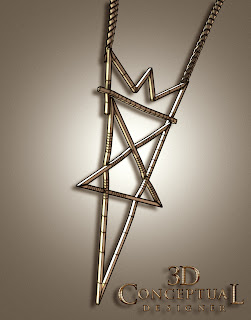
 A "Virtual" necklace worn by Billy Burke as Jonah King in Drive Angry used in the menus.


 Here is the low poly model of the necklace from Drive Angry.


 Here we see it with the mesh-smooth [subdivision added] applied to the above base mesh.


Project Review
Drive Angry 2011 PART I
Blue-Ray-3D Animated Menus

Client: via  Summit Home Entertainment via The Cimarron Group.
Art Director: Brian Larson.
Project Date: February 2011.

About one year ago I did my last job for The Cimarron Group, who were my full time employers for about six years from late 2003 to October 2009. As budgets dropped so did my contributions to Blue Ray Menus, but for Drive Angry, I got the call, and helped render out nearly 500 HD frames of animation for the menus for Brian Larson,with whom I have done a few projects posted here with in the past.

In this PART I posting, I have two main props from the film I recreated in 3D, and I also animated the assets to fly into camera and hit the virtual windshield, our TV screen, as you make your choices in the menu.

In the film there is a Devil Worshiping Cult Leader who is the nemesis of Nick Cage in the film, and I built out his necklace from the film, all Sub-D, as well as the badge for the "Accountant" who is chasing him down from Hell with an FBI badge that magically appears, with his coin toss[ I did that too look for a PART II soon]. William Fichtner does an outstanding job as 'The Accountant', IMO.

Cheers, THOM