Tampilkan postingan dengan label Art Direction. Tampilkan semua postingan

Senin, 26 Maret 2012

Project Review: X-Men 2: PART III-3D Logos from a Single Vector


 A double plate 3D Logo design I did for X-Men 2, with some mild pitting in the scratched steel face.


 A glass plate with a heavy bevel and a thin metal plate on top for this X-Men 2 Log I did back a decade ago.


 The top X-Men 3D Logo objects have a heavy thick bevel and the holding device has about half as much. Sitting on a gloss black surface.


 Here I did a hollow face logo for X-Men, with a very big bevel in a warm environment for lighting.


 Here is a deep extrusion coming up from infinity to reveal the above logo with a much deeper holding post.


 A solid two plate design with the X objects pulled out from a bit in 3D space for this X-Men 3D Logo.


 For this alternate I revered the type move and put the "2" out front, I also then cut out the insides to make a deep pocket in there for heavy shadows on a simple x, and a 2.


Project Review
X-Men 2: PART III
3D Logo Designs from a Single Vector File


Client: 20th Century Fox Via BLT and Associates.
Art Director: Zack Ris
Date: Spring 2001

I had well over 200 logos I did for X-Men 2 from a decade back now, when I was an in-house 3D  Designer over at BLT and Associates, and today I have details on one sub-set all based on a single Vector file.

Part of what was great over at BLT, was that an Art Director would give me a single vector file designed in 2D, and also give me plenty of design space to create a dozen solves, not just one. 

Since I am versed in 3D design space,and most importantly, I was taught to think in three dimensions via my Industrial Design Degree from A.C.C.D., I always see a flat vector in multiple solves at delivery in 3D. I usually drop a few suggestions to an Art Director, but typically I do just one design for each logo, but here on X-Men 2, I had time to do about twelve per vector file.

I will be posting a few more solves from other vectors in the future for this X-Men 2 series I have here on my design blog.

You can view PART I here and PART II here, or you can search the blog using X-Men to see my X-Men 3, and First Class stuff as well.


Cheers, THOM

Kamis, 22 Maret 2012

Project Review: The Phantom 2040-PART LXXXXVi[96th]- More Character Color Keys


 A BIOT Mechanic in an orange Jumpsuit with a Readout mounted to his forearm.

 A Female BIOT named Pavlova from that episode. If I remember she was 'self aware" and unique.


 A Short BIOT on tracks, seen here as a sketched design.


 Here is Guran in a trench coat and mirrored glasses.


Phantom 2040-PART LXXXXVI[96th]
More Character Color Keys

Client: Hearst Animation Productions.
Art Director: Myself.
Project Date Spring 1993.


This is my 96th post for the work I did on the TV show, The Phantom 2040 from in the early ninety's, and today I have posted a set of marker comp color keys for a variety of characters.

As Art Director for the 52 episodes,  I was responsible for the overall visual themes and color language used for all characters, sets, and props for the series, and since we were doing the production digitally we did all color keys in markers and chalk rather than Cel Vinyl.

I always love taking my Conceptual Designs to the next phase and to bring the to life with color. As a Transportation graduate from ACCD, we are trained specialists in using markers and chalk to render out our concepts, as that was the preferred method prior to the advent of the digital painting technique that has replaced it, so I went with it, since the renderings were scanned and PMS colors were assigned to match on Korea for the final production.

If you are a FAN of The Phantom 2040, and on FACEBOOK, there is a group for that....  here.

There is a TAG on the list to the RIGHT for other Phantom 2o4o entry's, but you can click this as well.

Cheers, THOM

Kamis, 15 Maret 2012

Project Review: Virtual Magic Kingdom PART VII-Curvilinear Perspective Wrap-Frontierland


 Here is a scan of the clean Curvilinear Perspective Grid I made from North , East, South, and West vanishing points for these wraps.


 Here is the 38" wide Frontierland full HUB sketch I did back in the mid nineties.


 Here I overlay the grid over my sketch so you can see how I followed the base grid  for my drawing.


 Here is a close-up shot of the far LEFT of the sketch looking to the gate.


 The middle of the  wide sketch with the various old buildings.


 A close Up of the RIGHT side of the wrap with the Haunted Mansion there at the end on the hill.


Project Review: 
Virtual Magic Kingdom Video Game PART VII
Frontierland Curvilinear Perspective Sketches


Client: Disney Interactive
Art Director: Myself
Project Date: Summer 1996

This is my seventh post in my series on the Virtual Magic Kingdom [ VMK] project I did for Disney Interactive back in 1996, and with this post, I cover  third HUB perspective wrap that I , and this time I worked on a old muddy, rutted road with the town of Frontierland smack in the middle. You can view the rest of Frontierland here.

We put the Haunted Mansion on on end of the town, and the big Gate on the other that leads back to the HUB. You can also see this in my large overhead sketch here. A fun exercise to develop the overall look and be able to see it in 360 degrees as well.


I have taught fish-eye perspective using grids for years, it certainly helps you visualize a real dimensional space, as this sketch was then built out in 3D for the game in Alias Wavefront[ Pre-Maya days] by the talented 3D team.


You may review my earlier VMK posts in these link-a-dinks:

PART I
PART II
PART III
PART IV
PART V
PART VI

Cheers, THOM

Kamis, 08 Maret 2012

Project Review: Virtual Magic Kingdom PART VI-Curvilinear Perspective Wraps

 Here is the full 360 wrap for the Adventureland hub, near the Jungle Cruise for the Video Game we were developing back in the 90's at Disney Interactive.


I printed this out on the color xerox and made a cylinder that you could stand-up and view to get the feel for the space in 3D[ it worked great!], a 2D version of Quicktime VR from the era in sketch format!  Here is a 3D Mock-Up to Illustrate this technique


A close up on the RIGHT side of the wrap with the Pavilion in center.


A close Up of the LEFT side of the wrap with the Queue for the Jungle Cruise.


Disney Interactive: VMK
Virtual Magic Kingdom DVD Game
Curvilinear Perspective Wraps

 Part VI

Client: Disney Interactive
Art Director: Myself
Project Date: Summer 1996

This is my sixth post in my series on the Virtual Magic Kingdom [ VMK] project I did for Disney Interactive back in 1996, and with this post, I cover a second perspective wrap that I did for a full 360 view from one of the game "Nodes".

They wanted a single sketch that would help them visualize the view from a specific point in the hub at the Virtual Disneyland Park we were making for the Virtual Magic Kingdom game so I did a sketch for each land.

You will notice that the artwork uses the fish-eye perspective grids I based on M.C. Eschers study of this drawing method, so I developed it to the project. I even taught the team curvilinear perspective to follow the theme we had for this game. A very fun time I had there with a great team, and now that I am back doing work for WDI, I pass by the old building on a regular basis.

You may review my earlier VMK posts in these link-a-dinks:

PART I
PART II
PART III
PART IV
PART V

Cheers, THOM

Rabu, 07 Maret 2012

Project Review: NEXT (2007): 3D Motion Graphics Design PART I

 Frame One of the final Finished Title treatment for the film NEXT from back in 2007.


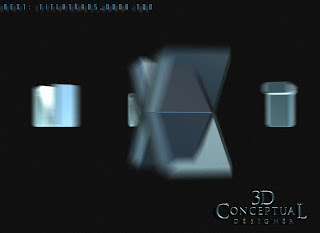
 The final animation I provided to Tom Kositchotitana in Motion Graphics had 3D motion blur used on the 3K frames.


 An animated Gimbal move with the type letters rotating into the final position.


 Almost seated and final in about 1 second total for the move.


 The last frame with all seated and a slight flare near the 'X', in Next.


 Here we see a simple 3D heavy beveled type object in a mesh-view, but look closely, as I convert these simple items to an editable polygon , and then put a little bevel on all edges to catch mini highlights on a small face edge as a third read. This adds a lot to a simple object like this, as the lights will naturally animate on these little slivers well.


Project Review
NEXT (2007)
3D Motion Graphics Design  PART I

Client: Revolution Studios via The Cimarron Group.
Art Direction: Geoff Calnan, Tom Kositchotitana, and myself
Project Date: January 2007


Today I have posted up my first in a series on the 3D Animation Motion Graphics work I did for this film[ among others]. I primarily do print work, with well over 1000 3D logos done this last decade for Theatrical clients, but I have also finished to film nearly 85 final Motion Graphics pieces, like what is seen above and is in the final trailers as well.

I always work with an After Effects artist on Motion Graphics work, as I am a 3D Animator/3D Designer to them, and I provide the raw frames for their composite.

 I have worked with Tom K. for almost every Motion Graphics piece I have done[ 95%], and we always get this type of work finished on time and under budget whenever we have done the 'T-N-T**' production.[**Tom and Thom]

For today, this first part in this new series, we see a simple metal 3D logo with a heavy extrusion gimbaling into frame for a Title seat. I added the double edges on all sharp outer parts to get that little highlight running around the edges as well, something I often do to simple stuff like this.

It is FUN to create and deliver this stuff!

Cheers, THOM


Selasa, 06 Maret 2012

Project Review: The Phantom 2040-PART 95: LXXXXV- Small Stuff Props

 A Coffee Pot I designed for The Phantom 2040, used in the Dorms and also re-used with the Maid B.I.O.T. here.

 A small compass, not sure who used this one it was unmarked, but it was a Phantom prop for sure.


 The Phantom used this cable rider for a few episodes, and it was a pick-up prop requested by the animators in Canada for the project I did this on-site while I was there visiting the vendor in 1991.


 Here is a small old styled pocket watch used by Graft when it was the flashback sequence.


Phantom 2040-PART LXXXXV[95th]
Small Stuff Prop Design Drawings

Client: Hearst Animation Productions.
Art Director: Myself.
Project Date Spring 1993.


This is my 95th post for The Phantom 2040 from in the early ninety's, and today I have posted a few small props that I did for the show as a quick post.

When you do a futuristic setting everything see needs to be addressed in design. Characters and the overall world come first, but this world then needs to be filled in.

I had to design anything seen, or especially touched, used or referenced by and character in the story, but I also needed to fill up areas so I designed literally hundreds of these little bad boys to fill the world of METROPIA!

Are you a FAN of The Phantom 2040, and on FACEBOOK, there is a group  here.

There is a TAG on the list to the RIGHT for other Phantom 2o4o entry's, but you can click this as well.

Cheers, THOM

Senin, 27 Februari 2012

Project Review: Launch City PART VIII[ 8th]-The Target Jukebox Design 1999.

Here is the original final shot for Launch CD-zine Issue #40 from 1999 @ 640 x 480 the size limit at the time fro shockwave to run smoothly.


I did a quick open and re-render at a higher rez to show some details[missing a few maps though after 14 years...]


Here is the main screen shot in geometry showing the model details I added in.


The set was a two wall configuration and I built a little conduit with the parked gum pushed up in the crack.


Here is a shot of the full to the floor jukebox as geometry for Launch.com

 Launch City Part VIII
The Target Jukebox design for Issue #40

Client: Launch Media Inc.
Art Director: Myself
Project Date: 1999

In this 8th post on LAUNCH city, I am posting work done on a jukebox built out for a Target sponsored space with a fully animated 3D jukebox.

This was one of my very first projects I worked on when I joined the three man team as Art Director in 1999. I love to model in 3D, and that seems to be something that many people do not like. 
 
To me the fun part is the build itself. I love the process of construction. This may be due to the fact that I am an avid woodworker, copper smith, and I love to sculpt and create, so naturally I would love virtual building too.
 
I made the model close to, but not exact to a famous iconic Juke box from the 50's for the project, and I passed it over to Cayce Justus and he skillfully rigged it up and animated the arm and curtains inside for me.
As a point in 3D history this is the project where I made a material editor breakthrough in 3DSmax with Chrome and Glass and applied it here in the default scan-line rendered. 
 
Remember this was 14 years back, pre GI and all the good render tools we know see as commonplace were not out yet, so lots of ambient lights to simulate bounce etc.

Cheers, THOM

To view PART I on Launch City you can go here.

To view PART II go here.

To view PART III for the Train Station "Twitch" look here.

To view PART-IV look here.

To view PART V- you can click here.

To view PART VI [ the sub!] go here. 

To view PART VII-The Vault, go here.


Jumat, 24 Februari 2012

Project Review: Mean Girls 2004: Motion Graphics 3D Logo design

 Round one had clean simple type done in diamonds and platinum for Mean Girls in 2004.

 A shot of the bracelet on black with the satin removed as an alternate for the MGFX design.

 This is the final that finished at 4K for the International Trailers.

 Here is a shot of the final image in quads showing the build.

 A low angle shows off how much I moved the letters around to fit the pink cloth final finished logo for Mean Girls.

  Here is a shot of the quad model showing. the welds I built into the chain links using the nPower tools.

Project Review
Mean Girls 2004: Motion Graphics 3D Logo design


Client: Paramount Pictures via The Cimarron Group.
Art Direction: Michelle Jackino and Erik Counter.
Project Date: Spring 2004.

My very first early Motion Graphics piece from my days at The Cimarron Group from 2003-2009, was done while Michelle Jackino ran the AV division, and I had the pleasure to work with the in-house Predator Erik Counter on Mean Girls.

Mean Girls needed a charm bracelet, fully built as the 3D logo for the piece, so I proceeded to begin my design in 3D. I started very straight and flat, but later on was directed to  really move the letters around so we put it on some pink cloth and I modeled it to conform to the shapes. It ended up finishing for the International Trailers.


Cheers, THOM

Kamis, 23 Februari 2012

Personal Project Napkin Sketching and Doodles Part XIX[19th]

 I added more stories to the quick doodle design I did here.[ I will keep adding height!]

These three little characters I designed are trouble!

A sad dark robot a bit depressed and worried.


I did this little snowman head right after the holiday season.

Personal Project
Napkin Sketching and Doodles Part XIX[19th]
 
 In this nineteenth installment of the Napkin Sketches, Drawings, and Doodles I do when I have a pen or pencil in hand, I have put up some more.

These doodles are quick ideas as well, usually 3-5 minute sketches as a speed challenge. I also often repeat and re-do concepts to refine them a bit like seen above. It is just like I do on a paid project, only it is spread out over days rather than doing twenty or so sketches of little robots in one afternoon, I do one a night for a week, with each one taking queues' from the last.

Today I have put up a 5 story version on the mini swamp house I have done before, only this round it is even taller. I will keep going to ridiculous then stop!

I also have a bunch of characters including the "Manny, Moe, and Jack-esque' three friend grouping. Each is very different from the other, but they are a matched set.

You can view the other parts as follows:
PART I
PART II
PART III
PART IV
PART V
PART VI
PART VII
PART VIII
PART IX 

Selasa, 21 Februari 2012

Project Review: The Phantom 2040-PART LXXXXIV[94th]-More Female Character Designs


The character NIA[ here] from The Phantom 2040, had a few outfit changes as she had a secret identity and this was her "Lab Outfit" she hid in for the series.


Kit Walkers friend Jenna, had many an outfit change herself, even a spacesuit, and here is a prom dress for her I designed.


Here is a 3rd  design for a character for 'downtown' near Cyberville, you can view a few added designs here, and here.

 Here is the last generic female character I did for the series.


Phantom 2040-PART LXXXXIV[94th]
More Female Character Design Drawings

Client: Hearst Animation Productions.
Art Director: Myself.
Project Date Spring 1993.


This is my 94th posting for my work done on the Television 2D Animated Series, The Phantom 2040 from in the early ninety's, and today I have posted a few character designs, as well as a few fashion designs I did for the female characters for the series.

When you design an entire world of the future, you cover everything you can, from architecture, Transportation,and Product designs, Fonts, graphics, and fashion designs. Hearst gave a big allowance to buy resource materials for the fashion design work, so I got up to speed on some current trends back in the 90's from Paris, to emulate my future versions for Metropia.

I also had a few 'sexy girls' they wanted to populate here and there in the city as well, especially at the party's downtown near Cyberville in the second season, it was a bit of a 'seedy' neighborhood, so they wanted some, "ladies' walking around down there.

Are you a FAN of The Phantom 2040, and on FACEBOOK, there is a group  here.

There is a TAG on the list to the RIGHT for other Phantom 2o4o entry's, but you can click this as well.

Cheers, THOM