
This is still one of my top Images I made for Launch.com back in 1999.

This was pre-quad modeling form me a decade+ back so here are the wire files...

Here is the establishing shot seen first in Issue #40 of Launch.com, this is the main lower area with a gift-shop in center.

Here is the close up move if you clicked on the center of the image for the shop.

This is the interior of the shop that was filled with advertising for this virtual online city.
At the base of the main staircase, there was a phone booth that we used for a few interviews.

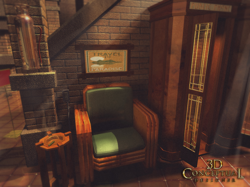
A corner set up for a multi person interview.

Used in Issue #42, an interview area with two band members was green screened into this space for the CDzine'.

The same corner seen above from a different angle, and this illustrates the power of a virtual set, just pick a good angle and shoot!
Launch City Part VI
The Vault
Client: Launch Media Inc.
Art Director: Myself
Project Date: 1999
In this seventh post on LAUNCH city, I am posting work done on the destination called, The Vault. I was hired by my fellow ACCD alumni Goutam Mitra as an ex-imagineer to theme the entire city out for them, and with this space, I had a whole bunch of fun.
I originally handed the space off to fellow ACCD team member John Wee, as a blocked out shell of a building to flesh out, but I ended up going back to it myself after a few weeks. I completely reworked the space, and finished it out as seen above myself.
Each space in Launch City, had a distinct architectural visual theme, so that the furniture, architecture, and even the fonts would be representative of the space so the viewers would "map' their locations visually back to the space.
Also each space had a minimum of 4-6 locations set up and ready to go for the virtual interviews and performances done for each months CD-zine and online shock wave alternative.
The vault theme, is what is called "The Chicago Style" as practiced by Louis Sullivan, so I used some themes I saw in his work to create this space. Also from the era of the 20's in general, so I used the chairs from the LA train station to fit them into the space as well.
Cheers, THOM
To view PART I on Launch City you can go here.
To view PART II go here.
To view PART III for the Train Station "Twitch" look here.
To view PART-IV look here.
To view PART V- you can click here.
To view PART VI [ the sub!] go here.


