


The texture map breakdown shows the procedural base material with the supplied texture map from the Art Director, Joseph Stamper.
Twilight Logos PART IV
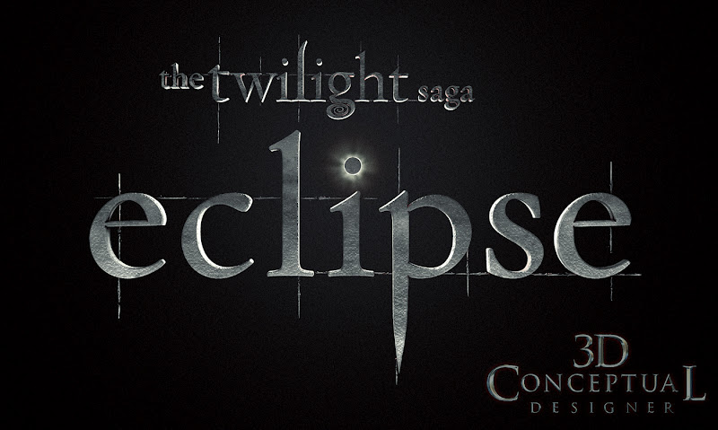
TWILIGHT ECLIPSE PART III
3D Logos and Illustrations for Print Advertising
3D Logos and Illustrations for Print Advertising
Client: Summit entertainment via The Cimarron Group.
Art Directors(s): Calvin Sumler, Joseph Stamper, and Chris A. Hawkins.
Project Date: Winter 2010.
I had the great privilege of working on all four Twilight ad campaigns, and today I post the work I did for the finished 3D Logo for the third film Eclipse done back in 2009, A bit out of order as I have posted the others already here so you can search using the Google toolbar up top on the LEFT..
Early in the series I had the room to experiment more with the look and feel of the logo, and we did a whole lot more variation and 3D sculpting, but as we moved forward they wanted a simple extruded logo so that is what I did.
On this third film in the series, I only did two versions of the logo for Joseph, and the only change was the scale of the texture map used, was made ultra small for a fine detailed look. The main 'gag" so to speak was the full eclipse of the "dot" in the letter I. I back lit the 3D scene with 3 different volumetric lights to get the aura feel correct around the moon. I also combines a Procedural texture and photographic color to achieve the look needed for this third round.
You can view PART I for the first film here.
You can view PART II for New Moon here.
You can view my 3rd post for Breaking Dawn HERE.
Cheers, THOM
Early in the series I had the room to experiment more with the look and feel of the logo, and we did a whole lot more variation and 3D sculpting, but as we moved forward they wanted a simple extruded logo so that is what I did.
On this third film in the series, I only did two versions of the logo for Joseph, and the only change was the scale of the texture map used, was made ultra small for a fine detailed look. The main 'gag" so to speak was the full eclipse of the "dot" in the letter I. I back lit the 3D scene with 3 different volumetric lights to get the aura feel correct around the moon. I also combines a Procedural texture and photographic color to achieve the look needed for this third round.
You can view PART I for the first film here.
You can view PART II for New Moon here.
You can view my 3rd post for Breaking Dawn HERE.


